Course
Data Visualization with Tableau
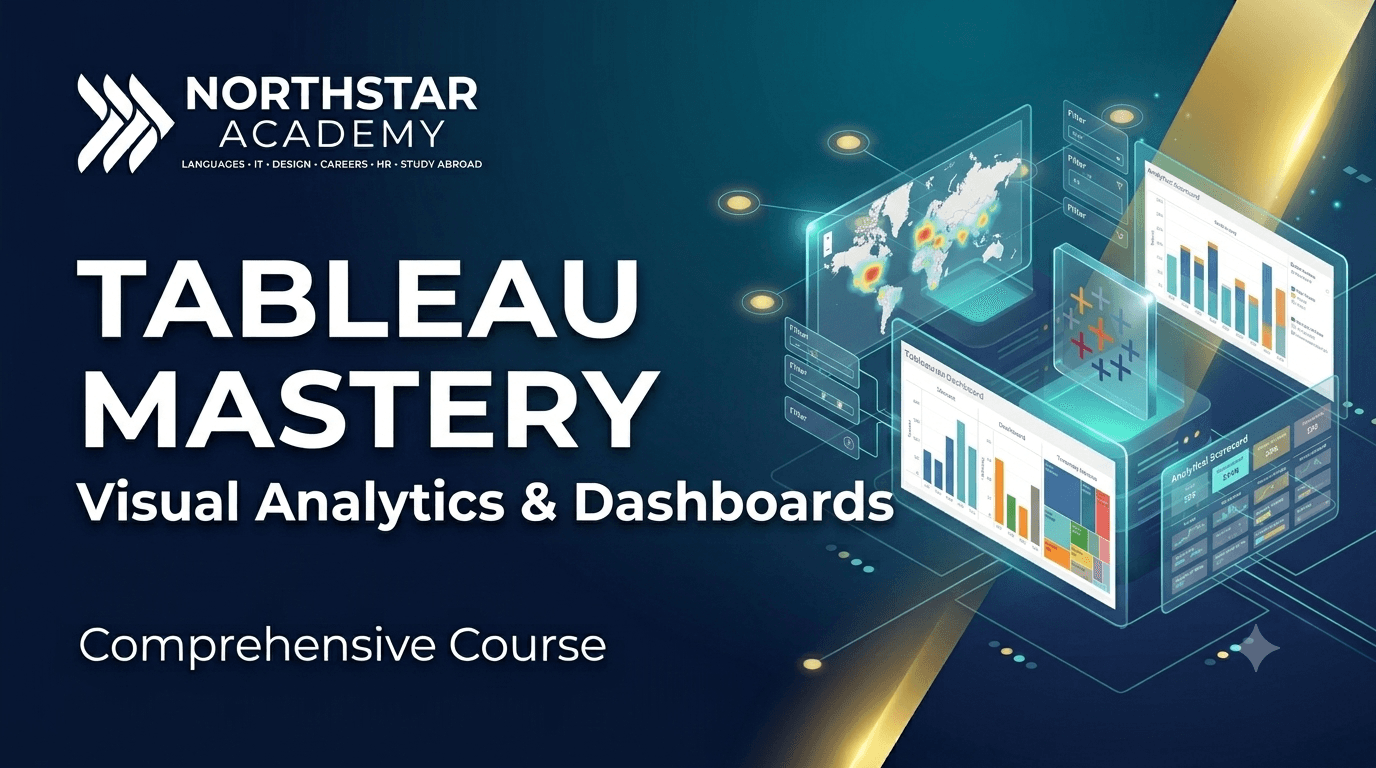
Learn to build interactive dashboards and transform data into clear, compelling visual insights with Tableau.
Who this is for
Designed for anyone who wants to create interactive dashboards and present data in a clear, engaging, and meaningful way. Suitable for students, business professionals, analysts, and anyone working with data. No prior Tableau experience is required.
Tableau is one of the world's leading data visualization platforms, helping organizations transform complex data into clear and interactive dashboards. In this course, you will learn how to connect different data sources, prepare and organize data, create effective visualizations, and design professional dashboards. Through practical exercises and real-world datasets, you will discover how to choose the right chart for different types of information, apply filters and calculated fields, and build dashboards that clearly communicate insights. By the end of the course, you will be able to confidently create interactive reports and present data in a way that supports better decision-making.
What you'll learn
Connecting and preparing data sources.
Charts, graphs, and visualization best practices.
Calculated fields, filters, and parameters.
Interactive dashboards and storytelling.
Dashboard formatting and performance optimization.
Real-world business dashboard project.
Dashboard publishing and sharing.
Applied final project and course assessment.
4 weeks